Slightly strange, but practical
Slightly Strange, but Practical
The first version of this website was built back in 2011, inspired by a design from Alex. It was intricate, creative, and a lot of fun to work on. But it was also overly complicated—we never actually finished it. Life got busy. I was working full-time, and Alex shifted focus to sharing his work on platforms like Behance and Dribbble. Our combined portfolio fell to the bottom of our priority list.
Fast forward to 2023, and I felt it was time for a revamp. With plans to ramp up my workload, I wanted something fresh. Sure, I could’ve tweaked a pre-made theme—it would’ve been functional—but I wanted something different. I wanted to strip away the “standard” features I’d usually assume belonged on a website: the top-left logo, top-right navigation, hero-position call-to-action buttons.
Instead, I focused on what truly mattered—what visitors to this site would actually be looking for. I realized that traditional branding (logos, headers, etc.) wasn’t crucial here. The real “brand” is us: Alex and me. So, I broke the rules. I ditched the header entirely and moved minimal branding to the footer, where visitors would naturally end up when sending a message. Depending on the link you click, you’ll either land on Alex’s portfolio or mine—no distractions, just the essentials. It felt a little rebellious to remove the header, but it works.
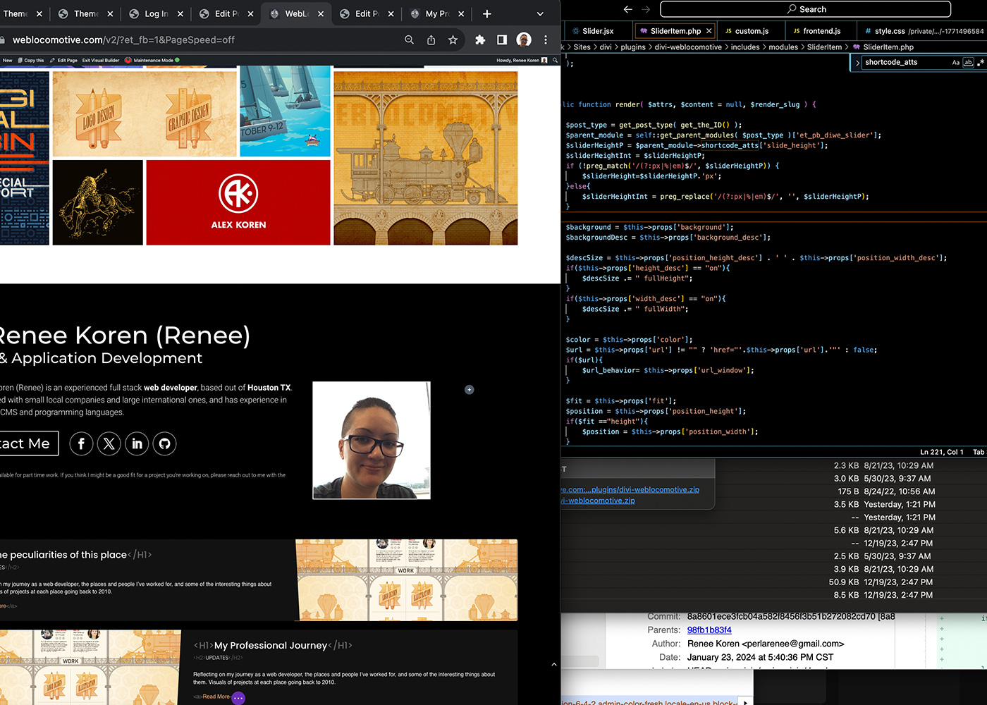
We opted for a single-page design. Alex’s section showcases his best work in a custom masonry grid, while I took a blog-style approach since my work is less visual. The grid items in Alex’s portfolio link to detailed project pages with light branding and hidden navigation—revealed only briefly on page load. Visitors can navigate related projects through a subtle carousel, letting Alex guide their exploration.
Project layouts are clean and straightforward, with space for product mockups at the top (like hats or t-shirts featuring his designs) and supporting images and text below. My blog, on the other hand, has a playful touch, with hover effects revealing extra details and mock code snippets for decoration.
We intentionally differentiated our sections visually: Alex’s portfolio is set on a white background, while my coding area features a black one. This contrast highlights the harmony between design and development, emphasizing how both come together to create functional and beautiful outcomes.
For this project, I built several custom modules for the Divi Builder (my go-to WordPress template) and shared them publicly on GitHub. It’s rewarding to create tools others can use while adding fresh work to my portfolio.
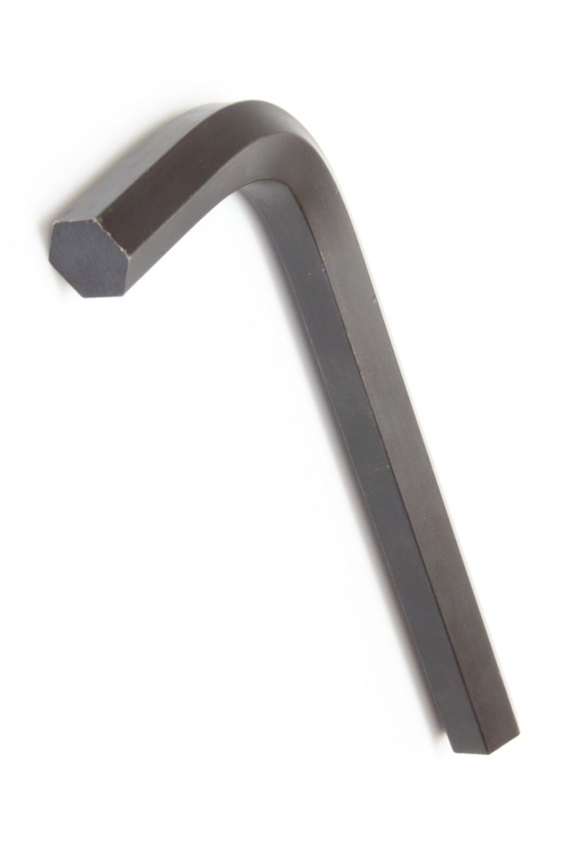
Finally, as I wrote this post, I struggled to find the right way to illustrate it. I wanted an AI-generated image—something unique, practical, and elegantly simple. After chatting with folks at my son’s sporting event, someone mentioned a screwdriver, which sparked the idea of… the Allen key. It’s a perfect metaphor for this project: a small, unassuming tool that’s incredibly useful when you need it.

